Sunday, 14 June 2015

Imagine Possibility

Morning, hope you are all enjoying your weekend. We have another fabulous challenge for you over at the Love to Create Challenge Blog where the theme is Anything Creative/Mixed Media Goes.
I created a mixed media canvas this week using PanPastels Turquoise Tint, Turquoise Shade, Turquoise Extra Dark and Permanent Red.
I applied DecoArt Crackle Paste through Finnabair's (Prima) Grungy Grid stencil to add texture to the background and I then applied the same paste through Tim Holtz Hearts Layering Stencil to add further interest.
I applied PanPastels around the background of the canvas and then added some paint circles using Fired Brick and Black Soot Distress Paints. I also added Remnant Rubs for added interest.
To give the backdrop some sheen I added Gold Mica Powder from Finnabair and Teal Zircon Primary Elements, both adding further layers of colour to the background. I then applied a coat of Mod Podge to protect and to prevent the PanPastels from moving whilst I applied further layers of the same colours.
I also included some vintage nibs for added dimension and added rusty wire around my centre piece. The centre piece is one of Sandra Evertson's cast pieces from Prima. I applied Crackle Paste to the Relic Cast piece, allowed to dry and then coloured with PanPastels and then added a coat of Mod Podge.
I also added some texture with a hot glue gun, adding strings of glue direct to the canvas. I also added touches of black splatters using Black Soot Distress Paint.
I added a metallic touch to the heart by applying more Gold Mica.
There is still time to enter our challenge and a chance to win a fabulous postcard from one of the DT members. My postcard from last week can been seen HERE, simply leave a comment on my postcard blog post for a chance to win a piece of art.


Thanks so much for stopping by. Tracy x x x


Thursday, 11 June 2015

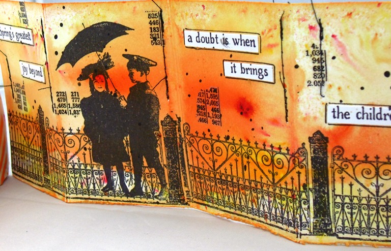
Spring's Greatest Joy

Welcome to my weekly post for Artistic Outpost and today I am using the fabulous SPRINGTIME stamp set.
I created a matchbox and coordinated accordion card.
My aim was to create a bright cheery piece created using Color Bursts Orange and Lemon Yellow, I love the pop of colour these give to my design.
I added Tissue Tape to the matchbox and a coordinated bead used as the pull for the drawer, attached to ribbon, again coloured with Color Bursts. I also added some random stitching to my design along with a few Remnant Rubs. The 'Spring' sentiment is from the Springtime stamp set. I stamped the focal image using Black Archival Ink.
The accordion fits perfectly into the matchbox and again I have added random stitching and Remnant Rubs for added interest.
I love the ornate fence on this stamp set and I decided to repeat stamp along the length of the accordion. I also added the sentiment from the Springtime Set, cut up and outlined with black pen.
I also added a few delicate splatters to the background for added interest.
Delicate paint splatters have also been added to the accordion.
Thanks so much for stopping by. Tracy x x x


Monday, 8 June 2015

Embrace Possibilities

Today I have my third Guest Design piece for Fernli Designs.
I have used the Fernli Extra Large Tag which I have decorated with DecoArt Media products. I coloured the background with DecoArt Media Mists Primary Magenta, Orange and Yellow and then used Andy Skinner's Mega Crackle Technique.
The focal piece is a Sandra Evertson Prima piece from her Archival Cast Embellishment range which I coated with DecoArt Crackle Paint, allowed to dry and then painted with Orange and Yellow Media Mists. I then painted over the top with a dirty wash and applied a coat of Ultra-Matte Varnish. I also stamped the text 'think' 'visualise' and 'create' using Visible Image stamps. I then added the hand to the top of my heart, added DecoArt Texture Sand around the edges and once again painted with Crackle Paint and coloured with Orange and Yellow Mists and then applied a dirty wash and finally applied a coat of Ultra-Matte Varnish. I added a Remnant Rub to the top of the hand.
I stamped the word INSPIRE from Visible Image to my design using Black Archival Ink and from this picture you can see the texture from the wonderful crackle and the rusty elements.
I added stamped circles using Finnabair' stamps and added rusty wire circles to each stamped piece for added texture and dimension.
I addd a further three stamped circles to the bottom of the tag again adding rusty wire to each.
Behind my focal piece I added a piece of Chicken Wire from Fernli which I rusted by applying a coat of Quinacridone Gold, then applying Carbon Black Antiquing Cream, and rubbing away some of the top coat with a baby wipe. I then applied a top coat of Ultra-Matte Varnish.
I stamped the word DREAM and 'embrace possibilities' to the bottom of the tag.
I added a circle of rusty wire around my focal image and also added some coils of rusty wire to the top.
I would like to add this to the Craft Stamper Make it Take it Challenge for June which this time around is all about TEXTURE and my piece is extremely tactile!

Thanks so much for stopping by. Tracy x x


Sunday, 7 June 2015

Live, Create, tell the story

Morning, hope you are all enjoying your weekend. We have another fabulous challenge for you over at the Love to Create Challenge Blog where the theme is Anything Creative/Mixed Media Goes.

As a new twist on Love to Create Challenges, the DT thought it would be nice to share our PanPastels love with you all, so for this challenge each DT member is giving away their project; a postcard. The DT are taking this opportunity to say thank you for following both the challenges and us, so have created this RAK (random act of kindness) giveaway. One lucky commentator will receive my postcard at the end of this challenge (Sunday 28th June) so that gives you 2 weeks to enter both the challenge and also comment on my blog. The winner of my postcard will be both announced on the Love to Create challenge blog and here on my own blog
    
I decided to go for warm hot colours using PanPastels Diarylide Yellow, Permanent Red and Permanent Red Shade. I adore these colours, so vibrant.

PanPastels are saturated with colour and very vibrant, you can lay down a lot of colour in one swipe; you can blend colours and add one colour onto another to make more colours with no contamination. Simply remove the second colour with a clean applicator. You also get very little dust with the PanPastels too and you can also erase areas with an eraser, great technique to use in mixed media pieces. When I am using several colours I tend to wipe away the first colour onto a piece of kitchen towel before going to the second colour. You can also mix colours directly onto the pastel, these are so versatile.
I began with the Diarylide Yellow, blending over the whole card and then moved onto the Permanent Red, and I then applied the Diarylide Yellow once again around the centre to create orange tones.
I used a Penny Black stencil as my focal image, I love poppies at this time of year, and mine are just coming into flower which is what inspired this piece today.
I also added a further layer of interest with a Crafter's Workshop stencil "The Story" and also included some random machine stitching for added texture.
Remnant Rubs add a further layer of interest and the black pops against the backdrop. I also included a ChitChat Sticker, outlined with a black pen for definition.
A few painty circles add more texture and interest and I also machine stitched around the outside edges.
I cannot wait to see what you all create this week for our challenge, looking forward to seeing all your entries.

Remember to be in with a chance to win my postcard, leave me a comment on this post and I will pick a random winner on Saturday 27th June with the winner being announced the following day. Don't forget to visit the other DT because if you do not win my postcard, you might win one of their fabulous postcards instead.

Thanks so much for stopping by. Tracy x x

http://welove2create.blogspot.co.uk/


Tuesday, 2 June 2015

Summer Fun With Sizzix

The beginning of a new month marks the start of a fabulous new challenge with Eileen Hull's Art with Heart Challenge and this month it is Summer Fun with Sizzix.
My make this month is an altered ATB using Eileen Hull's Block/Cube die cut from mountboard and decorated with DecoArt Media range.

All sides of the ATB have been painted with Burnt Umber Media Fluid Acrylic and once dry I added a random coat of Crackle Paste and once the Crackle Paste was dry I then added a dirty wash (Andy Skinner technique) over the top to tone down the colour a little and then added splatters of Cobalt Teal Hue. I die cut the seahorse using Tim Holtz Sand and Sea die, adding four layers to give dimension. I then painted the seahorse with Burn Umber paint, allowed to dry and then added Crackle Paste to the top, allowed to dry and then added Cobalt Teal Hue over the top.
Rusty wire has been wrapped around my ATB and around my Seahorse to add further texture to my piece along with shells for added dimension. I also die cut some foliage using Tim Holtz Greenery Die and coloured with Wild Honey Distress Spray Stain.
I added a piece of drift wood to the top along with a mini canvas decorated with paints and Crackle Paste along with beads for added texture . I also included a stamped Seahorse using Tim Holtz stamp along with more Rusty Wire.
The base is an old spool which I have painted with Burn Umber Acrylic with added mini shells for further interest.
ChitChat stickers have been added to the side along with die cut sentiment using Tim Holtz thinlits dies.
The opposite side has been decorated in the same way; I love the texture the Crackle Paste gives to the design.
http://www.eileenhull.com/
Thanks so much for stopping by. I look forward to seeing your artwork this month and hope you enjoy participating in the challenge. Tracy x x


Monday, 1 June 2015

A gentleman is always that: a gentle man

Today we have our monthly Product Focus and this month we are concentrating on stamp sets from the Masculine category. I am showcasing the Hats Background and the Hat's Off stamp sets from Artistic Outpost.
The background has been coloured with Distress Inks, applying Broken China Distress Ink through a layering stencil and then applying Gathered Twigs Distress Ink to the edges of the card for definition. I have also added a touch of background stamping for further interest.
I die cut the pocket watch from white card and added four layers to give dimension and then cut an aperture from the top die cut using the sized ovals from Sizzix. I coloured the top pocket watch with Broken China Distress Ink and then flicked with water. I also included a touch of background stamping.
I stamped the focal image with Potting Soil Archival Ink and added a piece of Mica over the top along with a numbered brad coloured with Alcohol Inks.
I stamped the sentiment onto white card with Archival Ink and sponged the edges with Gathered Twigs Distress Ink.
I die cut two circles from white card and added hats to each die cut piece using the Hat's Background stamp set. I coloured each circle with Gathered Twigs Distress Ink and added natural twine for added texture.

My fellow team members have created more wonderful pieces to inspire you along your journey.

Tracy (you are here)

Thanks so much for stopping by. Tracy x x